Timeli
_______
Task Management App
Role UX/UI Designer
Tools Figma, Adobe Photoshop
Year 2022
Overview
Timeli is a web app designed for product managers to help them keep track of their own tasks as well as their team’s. It was designed to solve a problem for a small, very specific user base, but can help anyone who is interested in tracking their tasks or others’.
Context
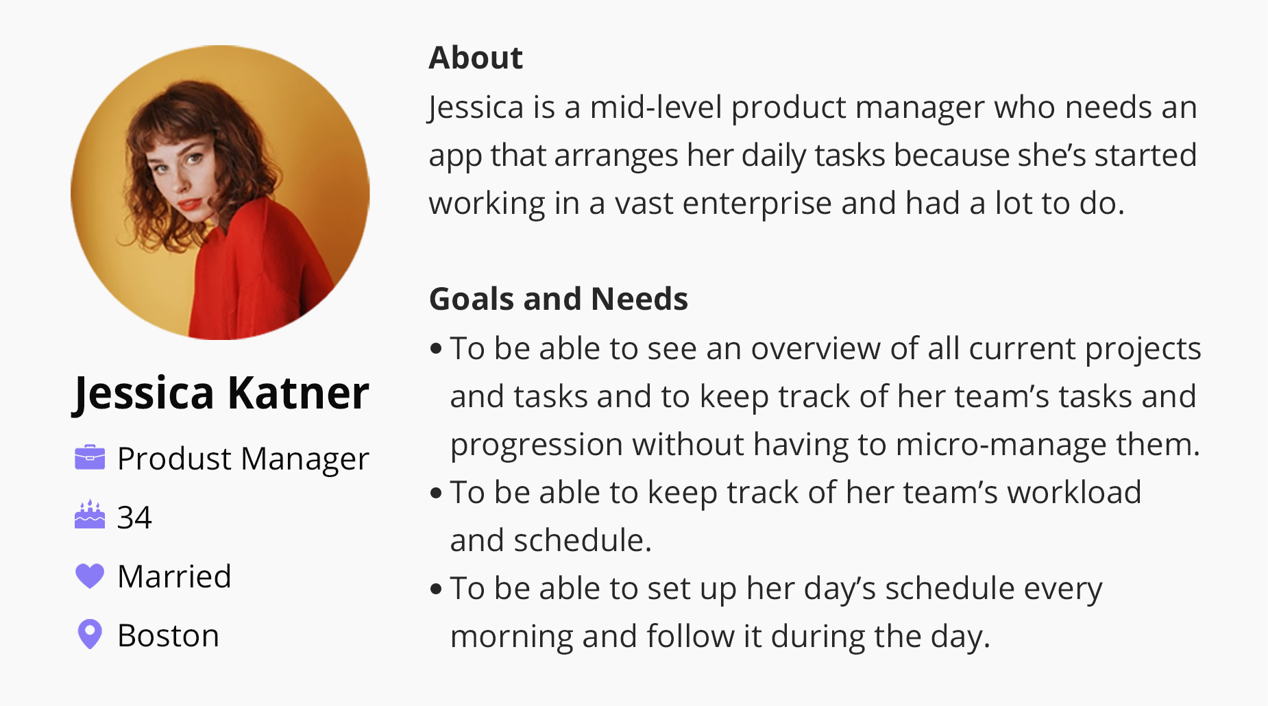
After completing my UX/UI studies I decided to challenge myself by joining My First Project Program run by Digitech, a digital learning community for digital programming and development. Each of the participating product designers was asked to design a web task management app based on a very specific brief, with the guidance of an experienced product designer, to be later given to developers who would build it. I got Jess, a mid-level Product Manager who started working in a vast enterprise and had a lot to do.
App Goals
The App would:
Make it easy for the user to set up their day’s schedule every morning and follow it during the day.
Give the user the ability to see an overview of current projects and tasks.
Give the user tools to keep track of schedule, tasks and workload.
Allow users to easily see the progression of tasks during the day.
Research
I conducted two in-depth interviews with two product managers in order to better understand their needs and their pain points. In addition, I researched different task management web apps and their features.
User Experience
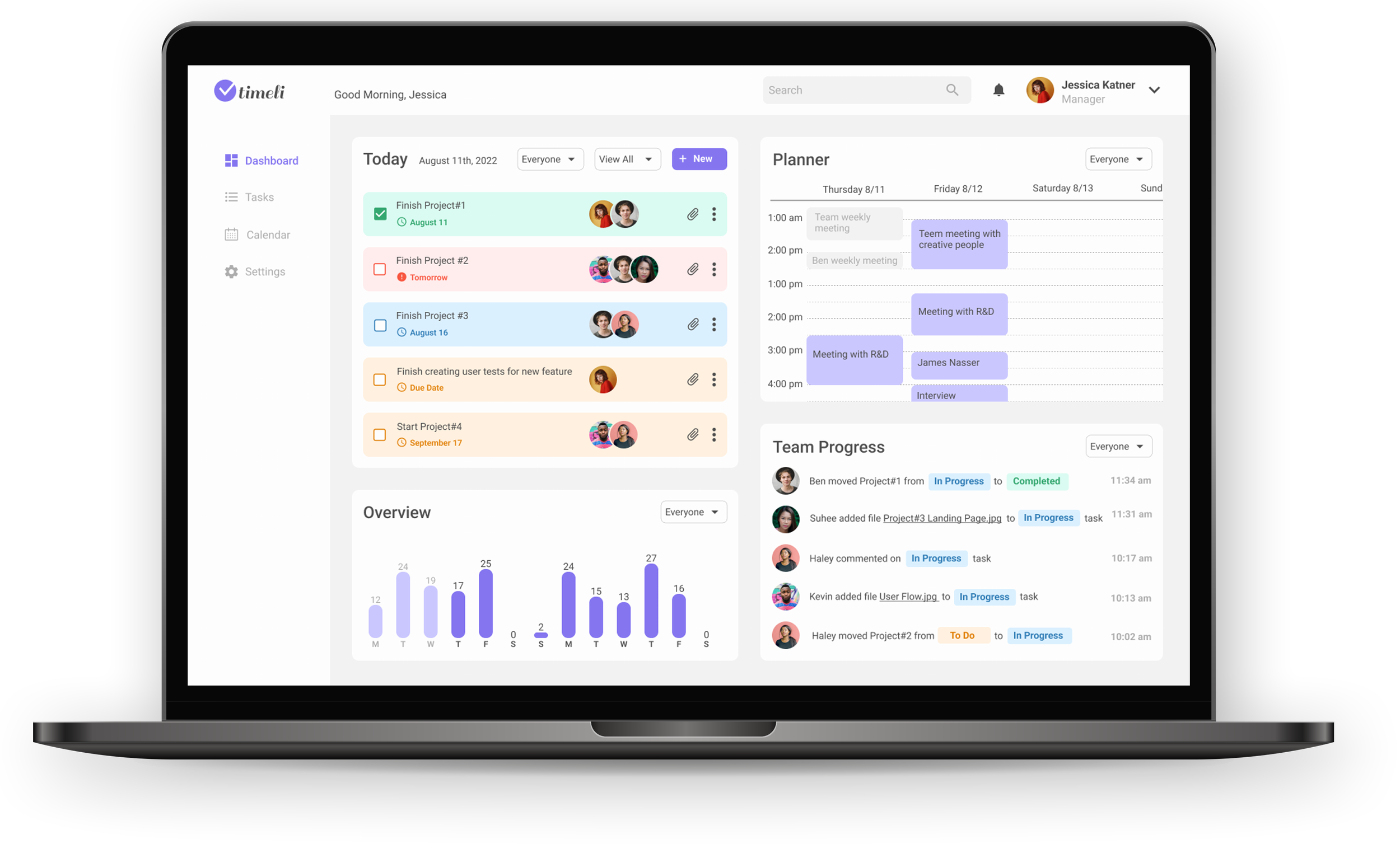
Since Jessica’s days are very busy I wanted her to be able to get as much information as possible from just a glance at the dashboard. I wanted her to be able to easily see an overview of current tasks and identify the status of each task, as well as the progression of her team members during the day, without having to invest a lot of time and attention.
User Persona
Design Concept
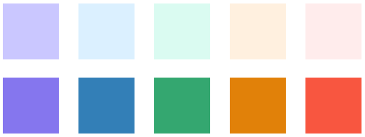
Since Jessica spends a lot of time working with visual materials I decided on a clean, minimal design, but I also wanted to create a visual way of identifying task statuses and following progression by only glancing at the dashboard. I chose white and grey as the base colors and purple as the brand color, while the other colors were derived from the task status colors: To Do in orange, In Progress in blue, Completed in green, and Warning in red/pink.
My I wanted the app to be clean, simple, modern, focused, practical
Color and Style
Soothing, light pastel colors and a simple, clean font.
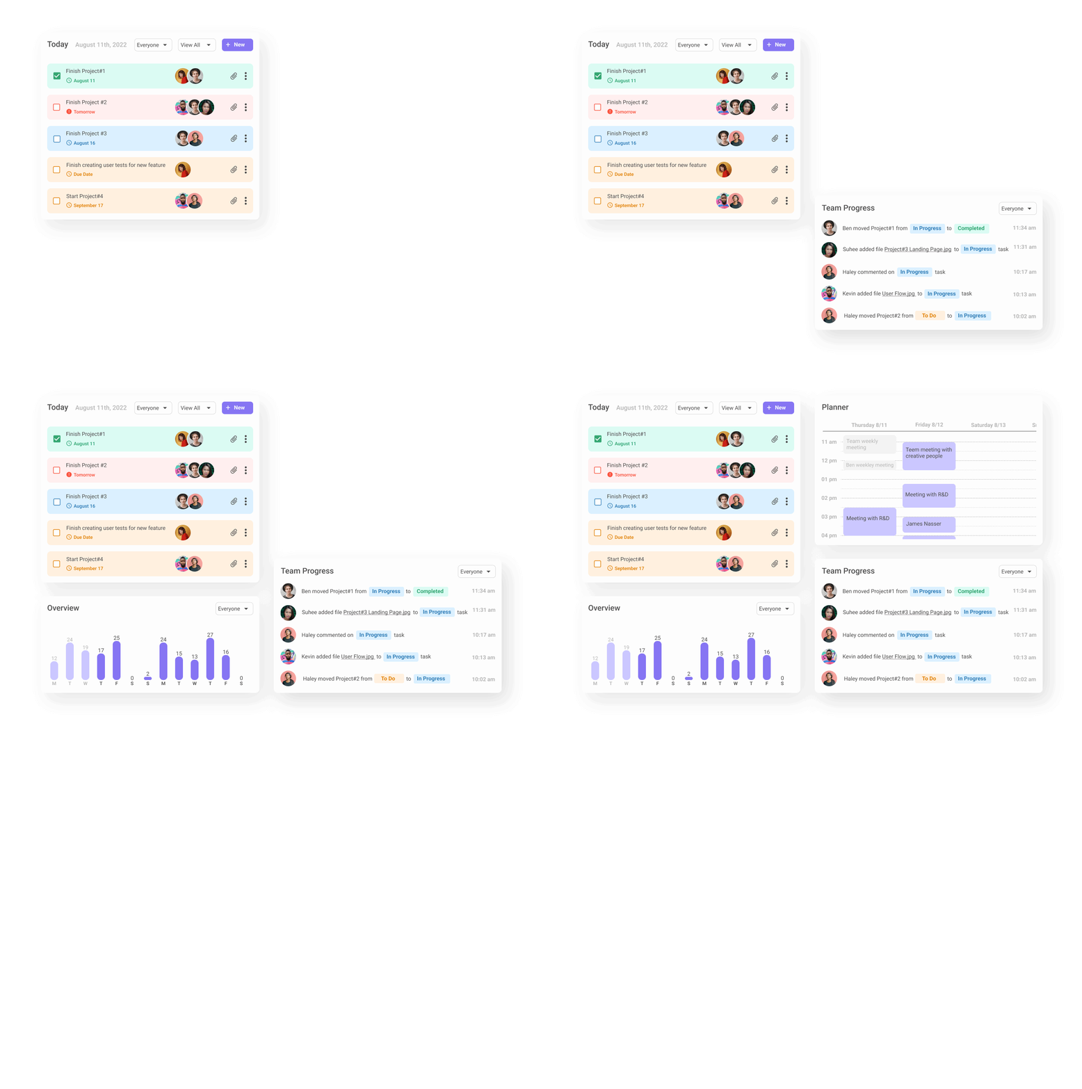
The dashboard contains four sections:
Today: A view of all the daily tasks, their status, deadline and the team member/s working on them.
Overview: Showing the amount of daily tasks for each day in the course of two weeks.
Planner: A daily schedule showing meetings and interviews.
Team Progress: A view of team members’ progression as they work on their tasks.
Screens
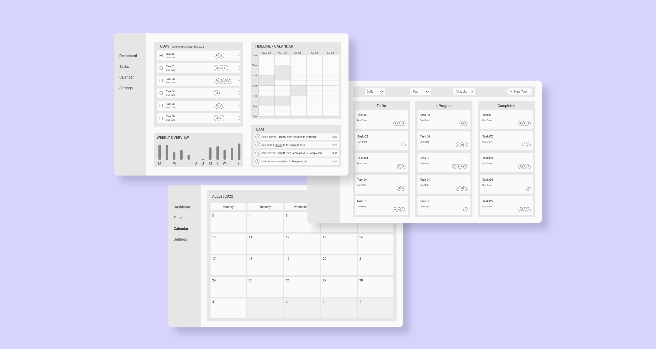
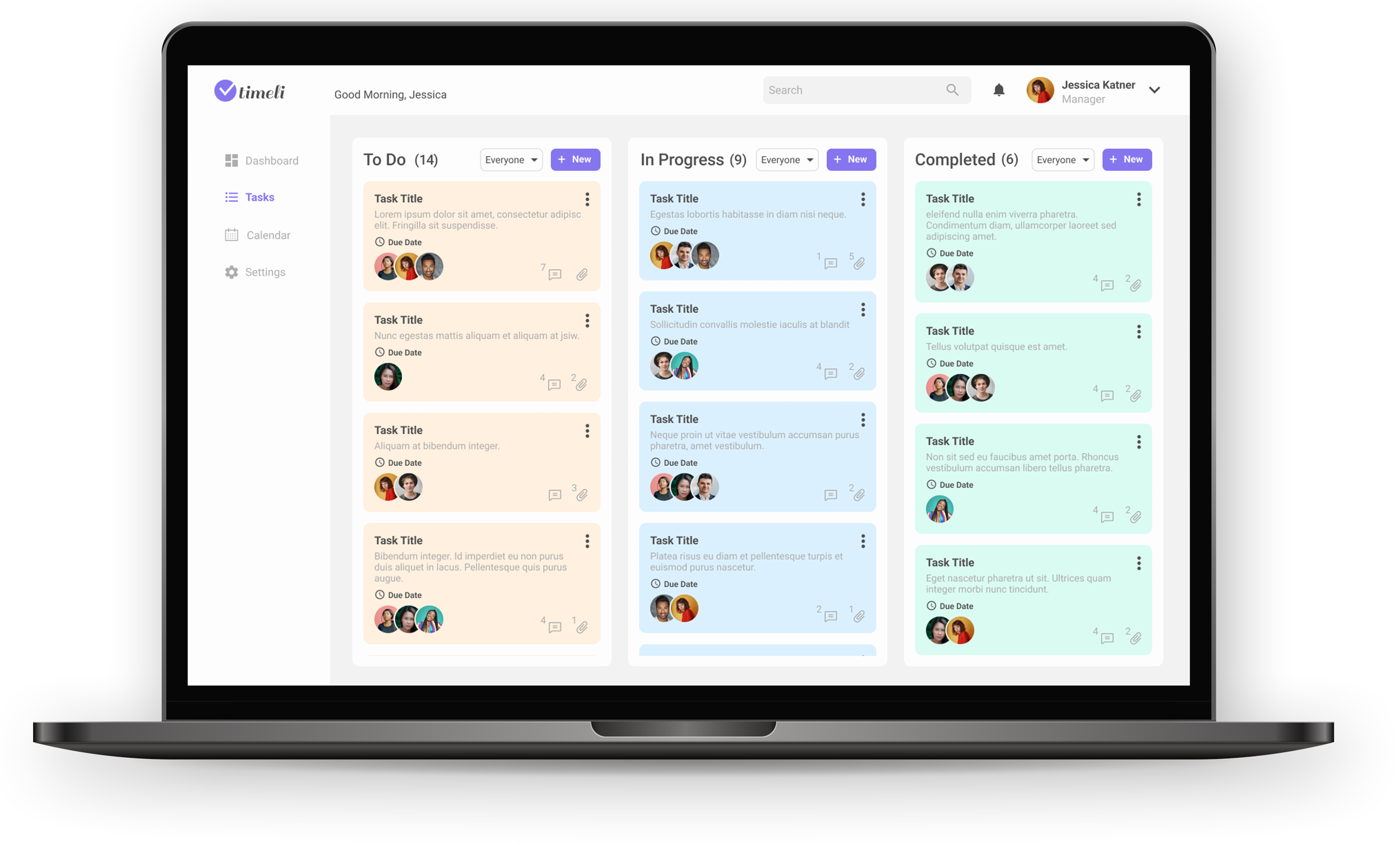
The tasks are conveniently divided into three columns based on their status. Each task card shows the task title, description, due date and the team members assigned to work on it. The cards can be dragged from one column to the other when the task status changes.
